Departing - A public transit web app

During my parental leave I found myself with a little down time while my daughter took naps and after she went to bed at night. I took this opportunity to develop a small webapp for the Stockholm Public Transit System (SL) using their open API.

This case study is not yet complete and is updated on a daily basis.

My role

Visual designInteraction designDevelopmentNap enforcementDiaper changesPlaydate arrangement

Background

Existing apps for checking departure times were clunky and required alot of manual input and typing. For a “trip optimizer” like myself, who wants to get to where they’re going as fast and efficiently as possible, they simply weren’t cutting it.

Existing apps

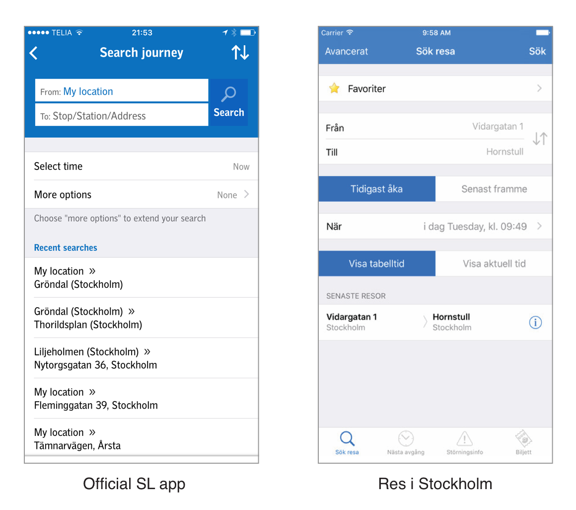
Two of the most popular apps in the Appstore relied heavily on text input and advanced search options.

The problem

Stockholmers are constantly chasing minutes, especially when it comes to their commute. Making the right train or bus can shave several minutes off of your commute! That’s right, several minutes. That’s huge!

Perhaps even more important than enjoying those extra minutes of your non-commuting life is the feeling of a perfectly timed and synchronised commute. It has the potential to set the tone for the rest of your day and ensuring you arrive at your destination in a good mood.

Key insights


1. Minutes matter

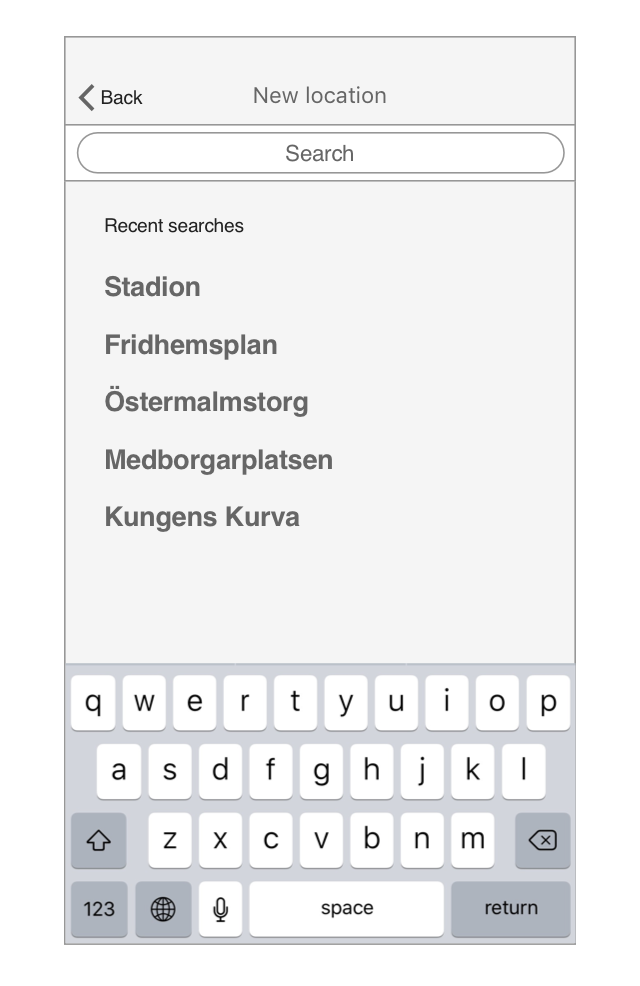
People running and diving through closing subway doors is a common site in Stockholm's subway system. People are willing to risk life and limb in order to avoid waiting 2 minutes for the next train. Opening up an app and typing in your current location and destination does not fit into this context.

2. A busy platform at rush hour is neither the time or the place to stare at your phone

Spending time typing and staring into your phone while trying to navigate a busy place like Central Station is not a good experience for you, or your fellow commuters.

3. You might not think to plan your trip until it’s time to leave

As you’re stepping out the door you might wonder if you should walk, power-walk or opt for a light jog in order to time the buss just right. Having to fumble around with an app, typing in the names of stations defeats the purpose as you spend several minutes staring and tapping at your phone.

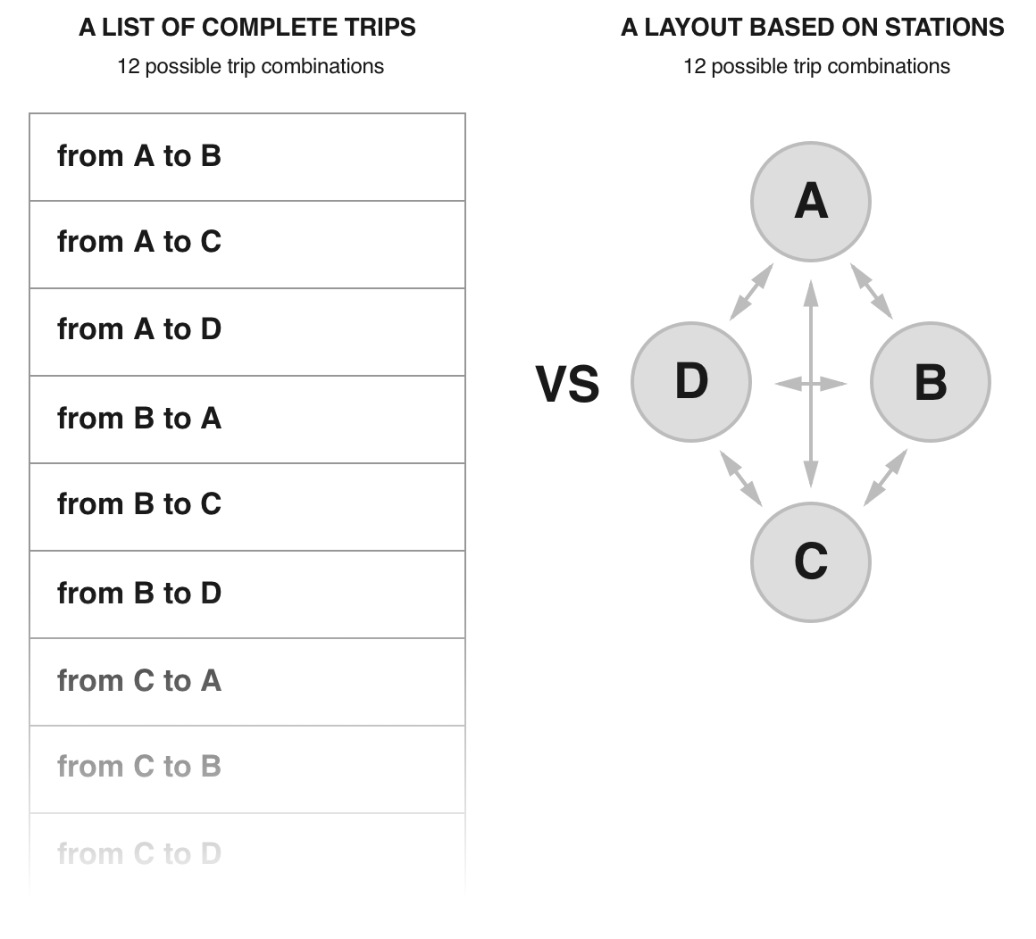
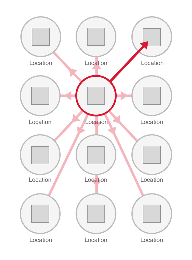
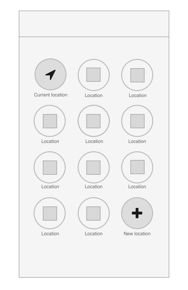
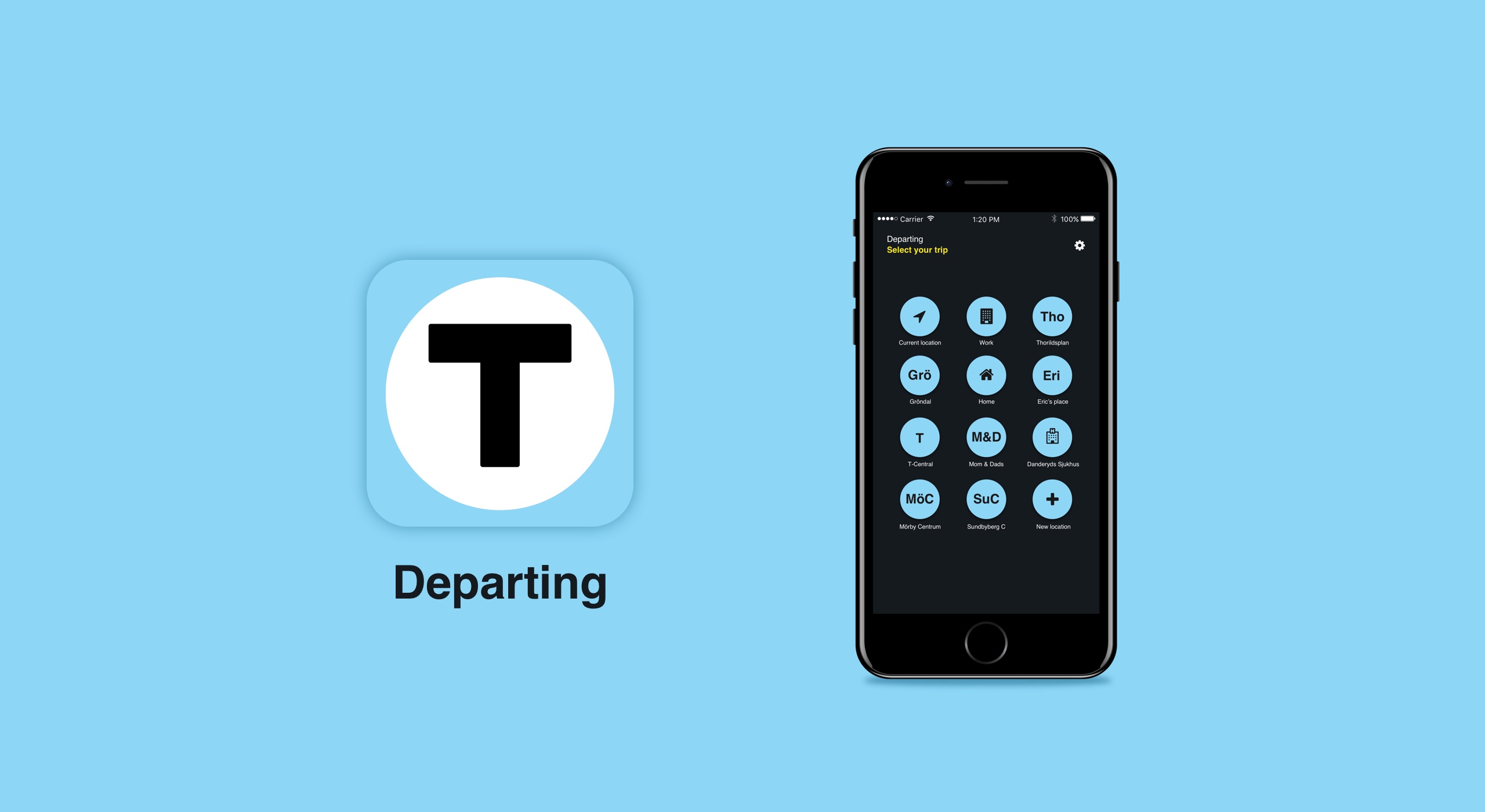
4. People only frequent a handfull of stations

We all move in predictable patterns, and in a typical week we might travel to an average of 6 different stations. We might not always make the exact same trip, but our trips tend to involve the same stations. Therefore relying on the lists of “recent searches” or “favorite trips” that current apps provide is rarely useful. The lists tend to become long when considering the wide number of trip combinations that are possible with only 6 stations (30 possible trip combinations).

Hypothesis


Existing apps are too cumbersome to be useful in crowded and "on-the-go" contexts

There is a plethora of apps that allow you to search and plan your commute. But they all require lots of typing or scanning through lists of “recent searches” and "favorite trips".

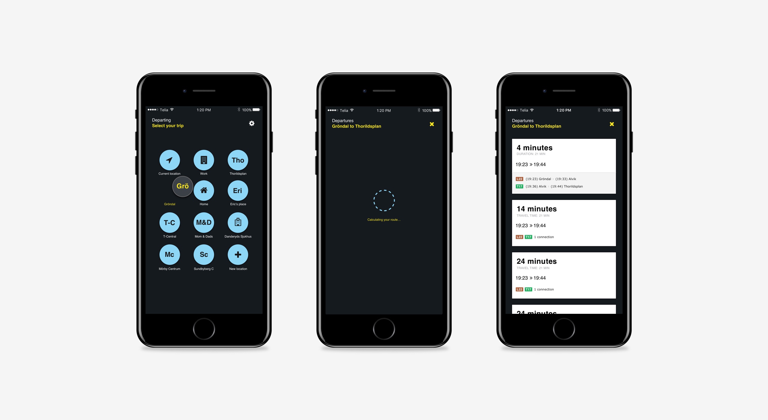
“By creating a UI that allows the user to spend less time in the app will provide a better experience and could help shorten the user’s commute.”

Interaction design

The success of this app would be fully dependant on the interaction. There were tons of apps on the appstore with the same basic functionality, this app was simply intended to do it better and more efficiently.

Driving Principles

At it’s very core this app is about being fast and accessible. I decided to go back to the basics of human computer interaction and take a look at what a mobile device is good at, and what it is less good at. This helped me identify a number of critiera or “principles” that would inform my design moving forward.

1. Killing the keyboard

Although one could argue that messaging apps, email and social media are making users more adept at typing on their mobile devices, I saw a clear need for reducing this input method whenever possible. Typing requires a high level of focus, a good grip of your device and tends to involve both hands. With every single tap of the screen there is the possibility of making a mistake. It was easy to see how this was not ideal for the busy subway platform or “on the go” context that I was designing for.

2. Increasing visibility

I knew that users tended to frequent a fairly small number of stations (6), but the patterns in which they moved between these stations was less predictable. This suggested that a traditional list with trips (a >b, b >a, etc) would quickly become very long and would not provide a very good overview.

By focusing on stations rather than complete trips, a very large number of trip combinations were made visible within a small amount of screen real estate.

List vs grid layout

4 stations make a total of 12 different trip combinations possible. A list grows exponentially with each added station and soon becomes long and difficult to scan.

3. Leveraging affordances

Perhaps the greatest strength of a mobile device (besides being able to fit in your pocket or the palm of your hand) is how their touch enabled screens allow for direct manipulation. This allows the user to complete a large number of interactions with only one hand, or even one finger.

With this affordance in mind a drag and drop based interaction quickly surfaced as a flexible yet robust pattern. By placing the users’ most frequently visited stations in a grid and allowing them to be dragged and dropped, users were provided with a clear overview of stations while trips were easily selectable using just their thumb.

Drag and drop layout

A grid based layout allows for a large number of trip combinations.

Endless possibilities

The grid layout created a limit of a total of 12 stations. Although I knew that most people frequented around 6 stations in a typical week, the app needed to be handle more scenarios to be truely useful. Enter the “Current location” and “New location” icons.

Current and New Location

“Current location” and “New location” were placed in opposite corners of the layout to increase findability.

Current location

The “Current location” icon accesses your geo location and makes it possible to find a trip from the closest metro or busstop without ever having to type.

New location

In case you need to go to or from a station that is not already in your station grid you can use the “New location” icon. Using this icon allows you to type in any station or address you would like. A list of recent searches is provided for quick access, reducing the likelihood of having to type.

Search - New location

Dropping a station on the “New location” icon allows the user to perform a regular search.

Visual Design

SL (Stockholm Public Transit) had just started rolling out their new graphic profile for print and signage at selected stations in the city. It was sleek, modern and dark and I decided to try it in a digital context.

Solna Strand station

Solna Strand was one of the first stations to get the new graphic profile designed by Familjen Pangea. It happened to be the station right by my work.

Embracing the dark

The dark nature of the subway signs felt like it would suit itself well in a digital context as well. In my opinion, Spotify provides an excellent example of a dark UI done right. It is immersive and bold but it lets the content take center stage. My app needed to be task oriented, it needed to be clutter free and the UI itself should not demand any unneccesary attention. A dark UI would lend itself well to that type of requirement.

“Just like Spotify had used their dark UI in order to place their ‘content first’, I wanted to use a dark UI in order to place focus on the users' tasks.”

Colors

Using similar shapes and colors as the physical signage at the stations was not only a stylistic choice but also a functional one. Since the app would be used in the subway and on the move it was important to quickly be able to switch your attention between app and signage to find the right train and platform. Using the same color reduces the cognitive load significantly when swithing between different sources of information.

Solna Strand station

I wasn’t able to find a proper styleguide so I used photographs I had taken while riding the subway.

Color palette

Typography & Iconography

Another aspect of the graphic profile I decided to incorporate was some of the typography and iconography. The icons borrowed their color (black on blue) from SL’s icons but were otherwise different in both shape and the amount of negative space they contained. My icons were round and were given plenty of negative space within their blue container, they were also given a slight dropshadow. These subtle changes were intended to give the icons a more interactive quality and suggest a draggable affordance.

Icon inspiration

The icons used by SL (left) were a strong inspiration for the draggable station icons in the app (right).

Validating the MVP

It was time to put the concept to the test. I needed to develop a working prototype in order to validate the concept. My daughter's nap schedule provided the perfect time constraint and forced me to prioritize and set realistic goals.

Constraints

My daughter’s nap schedules proved useful in setting constraints and limiting the time I could spend designing. It was especially useful since I did not have any deadlines, stakeholders or project managers that tend to be helpful in preventing designers from dissapearing into the rabbit hole of detailing and iteration.

Failing fast

I knew the design would probably change and evolve as I moved into code (it always does) so I decided to get coding as quickly as possible. This way I would quikly find out if there were any flaws in my interation patterns that are hard to spot in wireframes. It would also bring to light any technical contraints I might not have considered about building a web based app. All these things are good to spot early on before investing to much blood, sweat and tears into the concept.

I also wanted to get the concept into the hands of others as quickly as possible to see if there was any need out there for my app and what improvements might be worth focusing on next.

(N)on-boarding

I also decided not to build or design any kind of on-boarding for the app. Eventough I knew this would be absolutely crucial for user adoption in the long run I wanted to test the main interaction and usage of the app. Not only would it take me awhile to crack the on-boarding nut. Asking the user to set up the app before it being able to provide any clear value is always a challenge. Providing value up front, or atleast a clear promise thereof, is not always easily done and might require many iterations in itself.

In order to provide users with a personalized app from the start I would simply ask them for a handful of stations they frequently visited and simply fill the rest with stations I knew to be frequently traveled by most Stockholmers. I would then provide them with a link containing parameters for their personal web app and instruct them to add it to their homescreens.

Collecting Feedback

I asked around among friends and family to find out how they were planning their transit trips, and wether they were using any apps or other tools to help them. I also explained the premise of my app to see if they’d be interested in trying it out.

If interested, I told them any and all feedback was welcome and provided them with a link to a Google Doc I had prepared with questions regarding their experience.

What I learned

Beyond learning the basics of JSON and working with APIs the process of deciding on and validating an MVP taught me alot about product design and development.